Understanding Polo Collar Types and Their Brand Impact
Self-Fabric, Knitted, and Contrast Collars: Balancing Aesthetics, Function, and Brand Recognition
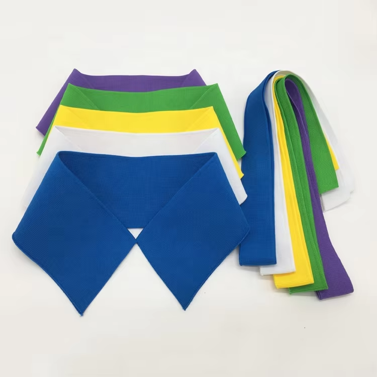
When the collar is made from the same fabric as the rest of the polo shirt, it creates that neat, simple look everyone wants for corporate branding these days. Knit collars are actually better at stretching and bouncing back than woven ones, which means they last longer on active wear stuff. Some studies show fabric fatigue drops about 30% with knits. For contrast collars, there's something about colors that really sticks in people's minds. Brands report around 45% better recall when their color choices match what they already use elsewhere. But watch out! Too much contrast makes folks feel like they're wearing a costume rather than business attire. And bad color combinations just confuse people instead of helping them remember the brand. No matter which type gets chosen, keeping the collar depth between 1.5 and 2 inches works best. That way logos stay visible without causing irritation or limiting how someone moves around during meetings or presentations.
Button-Down, Zip, and Stand-Up Collars: Enhancing Visibility Without Compromising Wearability
The button down collar provides good structure around logos, making them stand out better when people are talking face to face. Studies suggest something like a 70% improvement in brand visibility at normal conversation range, particularly if the placket sits right where someone would naturally look when meeting another person. Zippered collars work two ways basically. They start off looking like regular open collars but can flip up to create this neat stand up look, which means twice as much space showing off company branding. Stand up options like mandarin or band styles give brands room vertically for longer logos or initials, although these need stronger internal support so they don't curl after repeated washing. All these different collar designs focus on comfort without sacrificing appearance. Raglan seams across the shoulders combined with fabric mixes that stretch well keep most folks comfortable over 85% of the time according to field tests. The branding stays put even when moving around, no stretching out or getting messed up during daily activities.
Strategic Color, Pattern, and Material Customization for Polo Collars
Color Blocking vs. Tone-on-Tone: Reinforcing Brand Identity Through Subtle Contrast
The right color choices can turn simple collars into powerful brand statements. Think about color blocking, like those navy blue collars against white polo shirts we see so much in team uniforms or streetwear brands wanting instant visibility. Then there are those subtle tone-on-tone looks, say charcoal collar paired with heather grey fabric, which gives off this sophisticated vibe without being too flashy. That kind of restrained approach works really well for luxury labels and professional settings where understated style actually builds trust. According to some recent market research from WGSN in their 2024 report, around two thirds of shoppers link these tonal combinations with higher quality products. When picking colors for clothing lines, consider how much contrast fits the brand personality. Bright contrasting colors create energy and excitement, while softer transitions between shades tend to make people think something is more valuable or exclusive.
Jacquard Weaves, Embossed Textures, and Seasonal Patterns: Elevating Polo Collars Beyond Basics
When companies want to stand out, material choices make all the difference in how customers see their brand, beyond just colors or big logos. Jacquard weaving lets brands embed their marks right into fabric itself, so there's no bulky embroidery to worry about. These woven logos last through dozens of laundry cycles too. Think about embossed surfaces for another layer of interest. Subtle textures like faint crocodile skin patterns or simple ridge designs work wonders when sticking to plain colors, making products feel handcrafted rather than mass produced. Brands looking to update their look for different seasons can play with tiny patterns too. Tonal stripes or flower shapes add freshness without going overboard for office wear. According to Pantone's latest textile report from 2023, clothes with textured collars seem worth 40% more than regular fabrics in tests. But here's the catch: keep it simple. Most designers find that adding just one texture element per piece keeps things looking clean instead of messy.
Precision Logo Placement and Sizing Guidelines for Polo Collars
Top Button Placket, Collar Stand, and Inner Neck Tape: High-Impact Yet Discreet Logo Zones
Getting collar branding right means finding that sweet spot between being noticeable enough and staying understated. Most people will see whatever's placed on the top button area, which sits roughly around 4 to 5 inches down from where the shoulder meets the shirt body. When someone pops their collar, the collar stand becomes visible from behind, something many fashion brands capitalize on for those action shots or lifestyle images showing movement. There's also that inner neck tape part worth mentioning. It doesn't shout at anyone, but appears only when buttons are undone, creating an interesting effect where folks get rewarded for getting close without feeling bombarded by messages. Women's shirts need special consideration too since their plackets tend to be shorter overall. Brands usually adjust placement upwards by about an inch or two to match typical necklines. And no matter what, always check how things look on actual mannequins dressed in realistic ways. Nothing beats seeing if text remains readable through all sorts of normal movements and positions people actually adopt in real life situations.
Optimal Scale, Contrast Ratio, and Legibility Testing for 3–6 Foot Viewing Distance
When thinking about logo size, remember it needs to work in actual situations people see them—not just what looks good on paper specs. Adult polo shirts generally need logos around 1.5 to 2 inches wide across the chest area. For younger kids wearing youth sizes, shrink that down to somewhere between 1 and 1.5 inches. Toddlers? Probably best sticking with something smaller still, maybe 3/4 inch to about an inch across. The colors matter too. Aim for at least a 4.5 to 1 contrast ratio according to those WCAG guidelines from 2018. That means white thread on black fabric works well, or black thread on white backgrounds. Just don't want anyone squinting to read the brand name later! Always test how readable the logo actually is in different lighting conditions before finalizing anything.
- View from 6 feet in bright daylight
- Assess from 3 feet in low-contrast indoor settings (e.g., restaurant lighting)
- Confirm visibility when collars are partially folded or shifted during wear
Garment-specific mockups are essential—cotton piqué shrinks differently than performance knits, and collar curvature affects how flat embroidery lies.
Embroidery Techniques That Maximize Brand Premiumness on Polo Collars
When it comes to making those polo collars really stand out, precision embroidery does wonders turning them into something customers can actually feel proud wearing as part of their brand identity. The stuff we're talking about here? We're looking at around 8k to 12k stitches packed into every square inch. That kind of density just screams quality workmanship and makes people think this isn't going anywhere anytime soon. Take screen printing any day of the week compared to what happens when logos get embroidered. These stitched marks hold up against all sorts of wear and tear too many times over regular washing cycles without showing signs of breaking down or losing color intensity. Want good results? Stick with either 40 weight rayon or polyester threads because they strike that sweet spot between shine, strength, and how clothes should move naturally. Place those designs carefully though - somewhere flat on the collar area works best so there's no weird bunching issues later on account of fabric curves messing things up. Embroidery might not handle subtle shading effects very well, but give it something straightforward like big lettering or simple logo designs under three centimeters and watch how the added dimensionality elevates brand presence in ways that last far beyond first impressions.
FAQ Section
What are the most common types of polo collars?
The most common types of polo collars are self-fabric collars, knitted collars, and contrast collars. Each has unique characteristics that affect aesthetics, function, and brand recognition.
How can I choose the best collar type for my brand?
Choosing the best collar type for your brand involves considering factors such as aesthetics, brand identity, visibility, and wearability. Furthermore, consider the intended use of the polo shirt and your target audience.
Why is collar depth important for branding?
Collar depth is important because it affects logo visibility and wearer comfort. A depth between 1.5 and 2 inches is recommended to ensure logos are visible without causing wearer irritation.
How does contrasting color impact brand recall?
Contrast colors can significantly improve brand recall, with studies indicating about a 45% improvement when brand colors are used strategically. However, poorly chosen contrasts can confuse brand messaging.
Why is embroidery preferred over screen printing?
Embroidery is preferred for polo collars because it offers durability and a premium feel. Stitched logos hold up well against wear and washes, maintaining color and design integrity.