Why Plain Color Rib Matching Demands Specialized Color Strategy
The Triad of Complexity: Dye Lot Variability, Stretch-Induced Hue Shift, and Light Reflectivity in Rib Texture
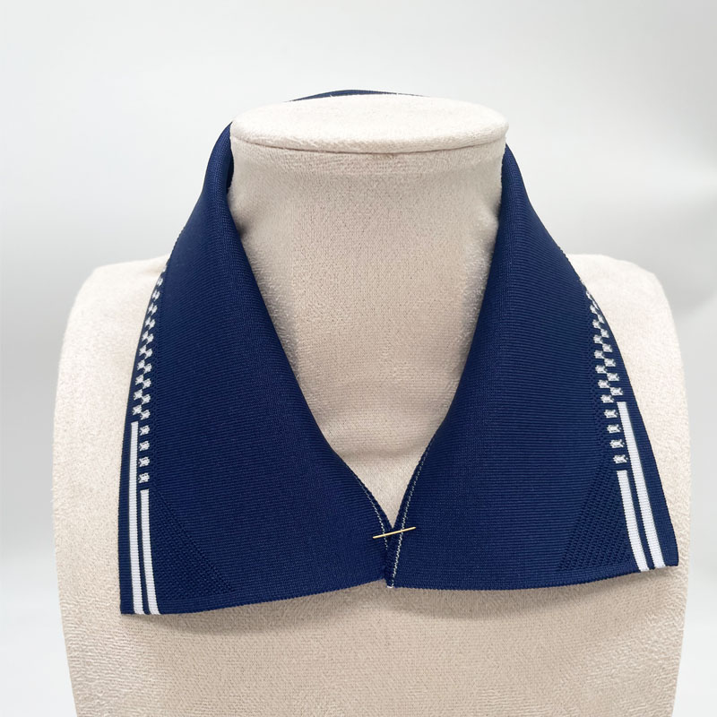
Getting plain colored ribs to match printed fabrics involves dealing with several tricky physical issues that all tie together somehow. The biggest problem comes down to dye lots varying between batches. Industry stats from last year show this accounts for around 75-80% of color mismatches in trim materials. Even when using exactly the same dye recipe, there will still be noticeable differences between fabric runs because of how fibers absorb dyes differently, plus variations in heat during processing and chemical balances in the batching tanks. Then there's what happens with ribbing itself. When it gets stretched out into things like cuffs or collar areas, the fibers actually spread apart slightly and scatter light in different ways, making colors look less vibrant by about 10 to maybe even 15%. And don't forget about the actual texture of rib weave fabric. Those little peaks and valleys create tiny shadows and weird light reflections that aren't seen on regular flat knits. This is why something that looks perfectly matched on a sample board ends up clashing completely after being sewn into a garment and worn normally. Factories tell us they see roughly 40-45% more rejects when they skip checking these factors before starting production runs.
How Rib Weave Amplifies Visual Contrast â Why Flat Swatches Mislead Production Teams
The way ribbing is structured naturally makes colors look different compared to what anyone sees when they just lay out fabric samples flat. Those little bumps and grooves in common 1x1 or 2x2 patterns create tiny shadows that can make the same dye shade seem almost 20% darker next to flat materials when viewed under normal lights. Teams who only check colors on flat samples often overlook this effect, which explains why so many need fixing later on. A recent Textile Quality Control report from 2023 actually points out these mistakes account for around two thirds of all color correction expenses after production starts. When ribbed fabrics get made into actual products, they bend and stretch, showing off various reflective surfaces at once. Printed fabrics don't do this because they stay pretty much flat throughout. Because of how light interacts differently between these fabric types, there will always be some visual differences even if lab measurements show perfect color matches. Anyone working with ribbed materials should always test them in their real-world shape and tension, checking under at least three different lighting situations before giving final approval.
Strategic Color Coordination: Moving Beyond Neutrals for Print + Plain Color Rib Pairing
Tone-on-Tone Harmony: Selecting a Plain Color Rib That Echoes the Dominant Hue (Not Hex Code) of the Print
Relying on digital color codes when matching ribs to prints just doesn't work well enough. The dye lots can vary quite a bit from batch to batch, sometimes causing around 12% difference in color tones. That makes those hex codes pretty useless for real world applications. What works better? Actually looking at physical swatches under the kind of lighting conditions they'll be used in production, like simulated daylight at around 5000K. Find what color family stands out most in the print itself. Then pick a rib that matches that general tone rather than trying to hit an exact digital match. Take a floral pattern with lots of red accents, for instance. A berry colored rib looks much better than going for Pantone 186 C exactly. Similarly, ocean themed designs tend to look more cohesive with deep teal instead of plain navy blue because of how different textures interact with light. The rib fabric actually absorbs and scatters light in ways that flat knits don't. Getting this right avoids those awkward color clashes that come from misunderstanding how materials behave in real life, not just their printed colors.
Controlled Contrast: Using the 60-30-10 Rule to Position Plain Color Rib as Intentional Accent, Not Afterthought
Plain color rib shouldn't just be an afterthought when designing garments. Think about it as part of the overall look by following something like the 60-30-10 rule. Most of what people see should come from the main print pattern, around a third from solid colors on things like body panels or yoke areas, leaving just about 10 percent for those rib sections. When done right, this changes how we view ribbing completely—from something that fills space to a real design feature. Take leopard prints for example. Pair them with black main parts and maybe some burnt orange ribbing around collar stands. The orange picks up on the warmer tones in the leopard spots without clashing too much. Production teams have noticed something interesting too. Garments made this way get about 27% fewer complaints about color mismatches than ones where they just throw in standard black, white or charcoal ribs without really thinking about color harmony.
Operational Best Practices for Reliable Plain Color Rib Matching in Production
Supplier Collaboration: When to Demand Custom Dyeing vs. Leveraging Pre-Matched Rib Libraries
When deciding between custom dye jobs and going with what's already available in color libraries, it really comes down to three main factors: how much fabric we need, how unique the colors are, and when everything needs to be ready. Custom dyeing makes sense only when dealing with special pigments like those shiny pearlescent inks or reactive metallic stuff, or when producing limited edition items where getting the exact color right matters more than fast turnaround. Most companies find that for big batches of seasonal products using standard colors such as navy blue, deep red, or that popular heather gray look, sticking with pre-dyed inventory actually works better. According to industry reports from last year, this approach can cut down waiting periods by around 3 to 5 weeks while saving about 40% on sample costs too. Smart businesses set clear guidelines at the beginning so they don't end up making choices based on gut feelings rather than actual business needs.
| Scenario | Solution | Cost Impact |
|---|---|---|
| Novel print/limited edition | Custom dyeing | 15â20% premium |
| High-volume core colors | Pre-matched libraries | 30% savings |
Spec Sheet Essentials: Documenting Rib-Fabric Relationships with Physical Swatch Tags and Lighting-Condition Notes
Metamerism happens when colors look the same under certain lights but change appearance under different ones, and this issue causes about two thirds of all problems with matching ribs to prints according to recent studies from Color Science Journal. If we want to avoid these issues, specification documents need actual physical swatch samples attached directly to the main fabric material. These samples must be tested under standard lighting environments including natural daylight at around 5000K temperature, typical store lighting which is usually around 3500K, and warmer household lighting at approximately 2700K. Every sample needs clear Pantone numbers written down alongside specific Delta E tolerances for comparison purposes, maybe something like Delta E no higher than 1.5 for really important projects. Digital color files simply aren't enough because differences in computer screen settings actually cause roughly 30 percent of mistakes during production runs. Keep those verified swatch collections handy throughout everything from initial design phases right through final manufacturing stages so there's consistent quality across all batches produced.
FAQ Section
Why does dye lot variability cause color mismatches?
Dye lot variability causes color mismatches because even when using the same dye recipe, factors like fiber absorption, heat during processing, and chemical balances can lead to noticeable differences between fabric runs.
How does the texture of rib weave fabric affect color appearance?
The texture of rib weave creates shadows and reflections not seen on flat knits, making colors appear less vibrant when the rib fabric is used in garments.
Why are physical swatches more reliable than digital color codes?
Physical swatches provide accurate color matching under real-world lighting conditions, whereas digital color codes often fail due to dye lot variability and lighting variations.
What is the 60-30-10 rule in garment design?
The 60-30-10 rule suggests using 60% print pattern, 30% solid color, and 10% ribbing to create a cohesive design with intentional accentuation of the ribbing.